We’ve made multiple improvements and updates to the Duda editor to help you build beautiful sites even better, with more design flexibility and customization options, so you can design sites your way. Get ready.
Save time with linked spacing
Now, when you set the spacing of a widget or a container, the opposite sides can be linked to make the spacing symmetrical while saving you time and extra clicks. Horizontal values will be linked by default, while vertical ones won’t (but you can click the chain icon to link them). This new option is available in both the padding and margin settings in Editor 2.0.
Enhance your site’s accessibility and SEO with the Color Contrast Ratio checker
Using the right color contrast ratio when building sites ensures that text elements are visually distinguishable from their backgrounds. This has several benefits, with the main ones being:
Better accessibility-An improved readability for users with visual impairments or color blindness
Improved user experience-Enhanced overall usability by reducing eye strain and better navigation clarity
A boost of SEO-An overall better user experience and optimization for accessibility means search engine algorithms will rank your site higher if it includes the right color contrast ratios
When selecting colors in both the Classic editor and Editor 2.0, you’ll see the new Color Contrast Ratio checker with either a failed (red X) or passing score of AA or AAA. These will let you know if the color contrast ratio of the text element you selected is good.
Cut per-device tweak time with automated default font sizes
We added default font size limits (which you can always override), to help you save time designing textual content per screen size with the Text widget. These size limits give you self-adjusting text sizes per screen size when using values within the limits. This time-saver is available in Editor 2.0.
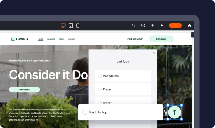
Easily add & customize a 'back to top' button
You can now add aBack to top CTAon any site page in Editor 2.0 with an anchor link destination. Pair it with theFixed button positionto show the back-to-top button in the same position as users scroll up and down the page. You can apply this to buttons and icons, and it works seamlessly across all screen sizes.
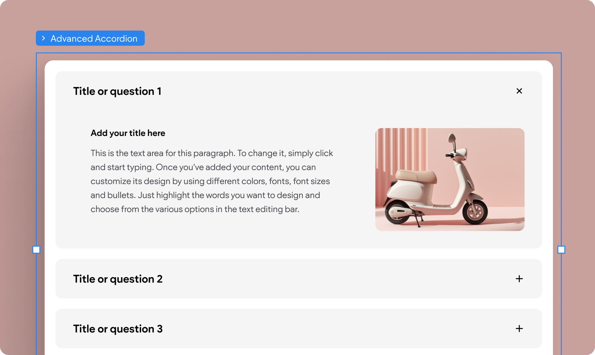
Set an image’s position per screen size
You can now decide where a regular or background image will be positioned on the element it shows on, to customize its appearance per screen size. This gives you the freedom to set a unique look and feel for desktop, tablet, and mobile, using the same image but with a different position setting.
This is available in Editor 2.0 and the Classic editor’s Flex Mode.
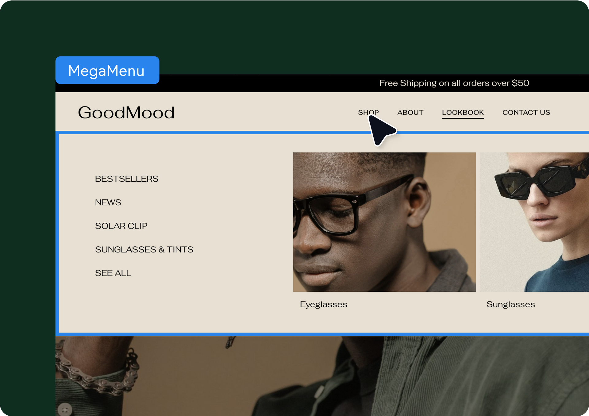
More List widget design customization with per-device layouts
We all know there isn’t a one-size-fits-all when it comes to web design. Using the same layout for all devices is less than ideal. That’s why we added per-device layouts to theList widget: You can choose a certain layout for desktop and tablet screens and another one for mobile.
This update is available in Editor 2.0.
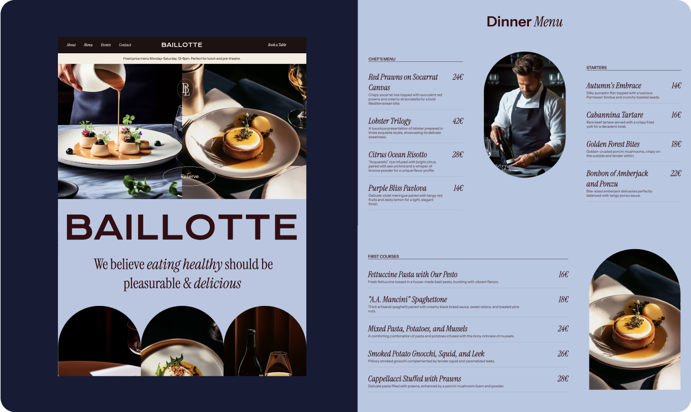
New Editor 2.0 template: Chef Restaurant
We added a stunning new template to our ever-growing collection for you to use, that encapsulates the essence of a professionally designed, high-performing site. Even though this one's ideal for restaurants and hospitality businesses, you can customize this template to suit any vertical of your choice.
This template includes a gorgeous homepage, an about us, a page for menus, one for making reservations, and another for getting in touch. And as always, our templates are Core Web Vitals optimized by default, to give you a great SEO start 😉
That wraps it up for this round of design updates. We hope you find these useful and beneficial to your workflow, and help you and your team get more out of Duda. More updates coming up soon...