BUILD HIGH-PERFORMING SITES
Website builder
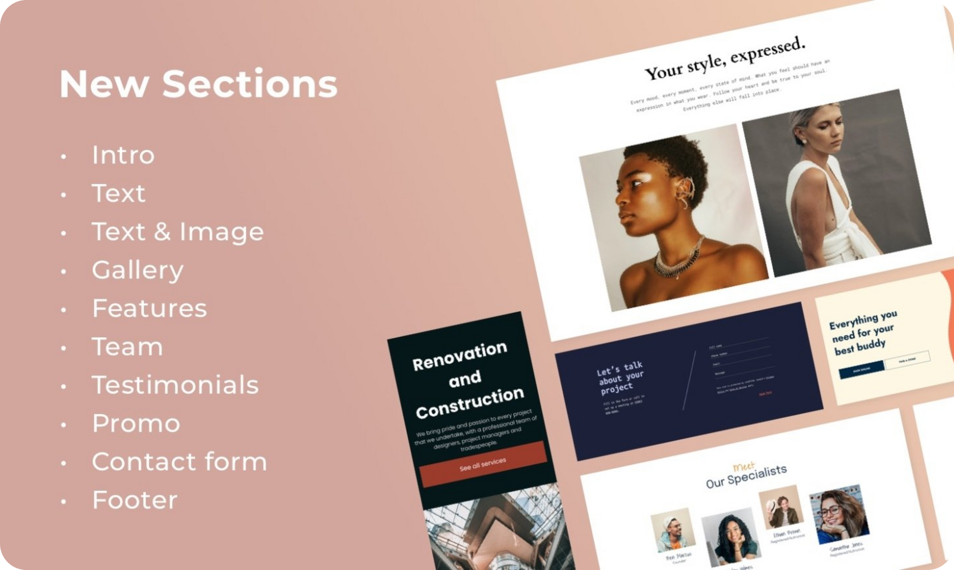
Create beautiful websites at scale
ALL ESSENTIALS INCLUDED
AI Stack
Boost your efficiency with built-in AI
tools
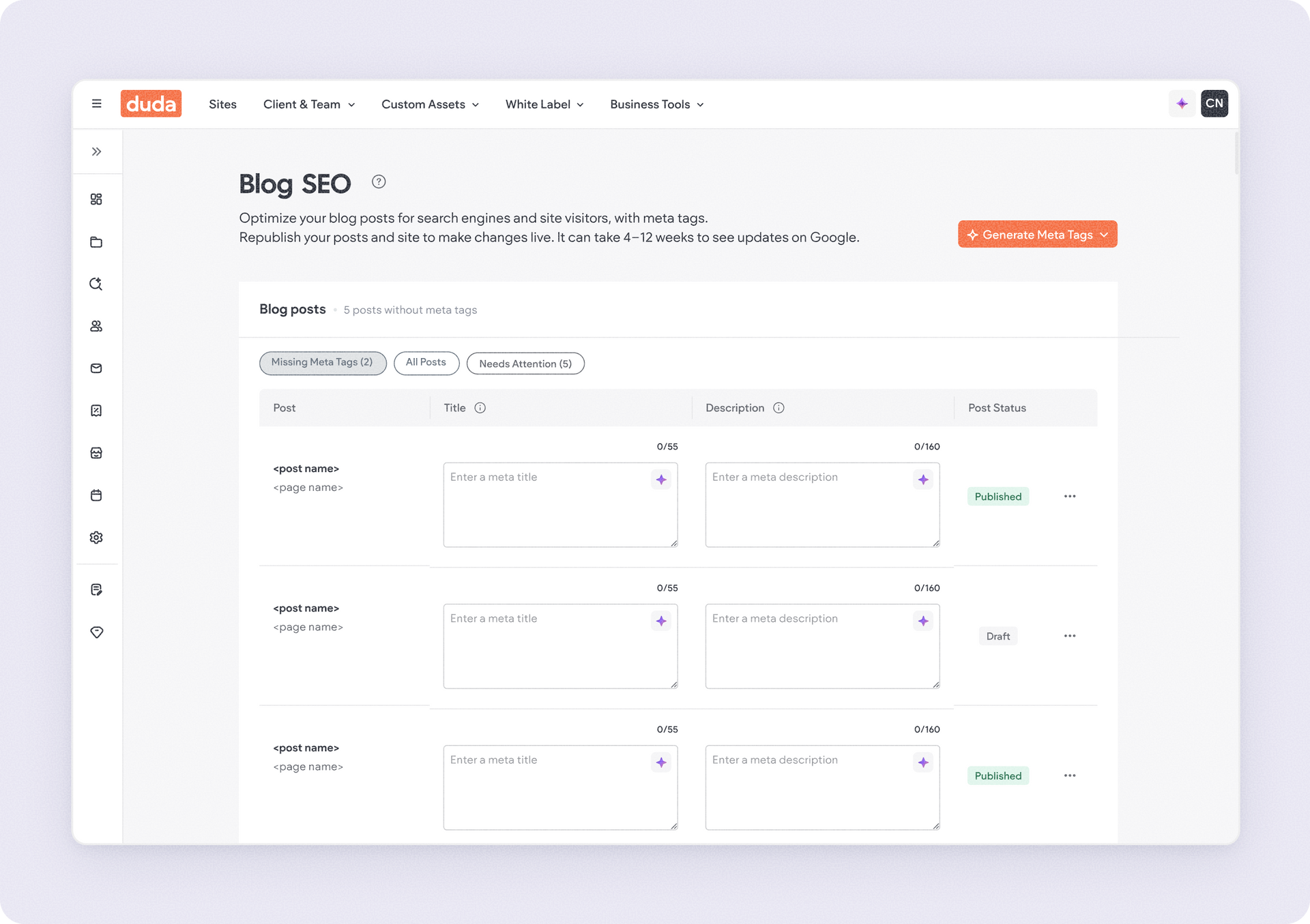
SEO
Build sites that rank higher
eCommerce
Sell anything, everywhere
Bookings
Embed powerful scheduling capabilities
ACCELERATE YOUR GROWTH
White label platform
Fully own your customer experience
Client management
Manage all of your projects in one place
Team collaboration
Invite staff and clients to work
together
Client billing
Manage client payments hassle-free
Automation
Unlock efficiency with smart automations


